Hastings Valley Vikings
Brand Development
Hastings Valley Vikings is a community rugby team in Port Macquarie, New South Wales. Upon consultation with club committee members, I was tasked with rejuvenating the club's identity, infusing it with a contemporary and distinctive appearance. Many Australian clubs tend to adopt professional team logos with analogous names—such as the Port Macquarie Sharks mirroring the Cronulla Sharks—the Vikings, with its unique identity and supported by the 'V' Brandmark complemented by the iconic Viking helmet.

In our initial discussions with the club, it became apparent that creating an adaptable emblem logo, supplemented by a complementary letter mark and mascot logo, would best encapsulate the essence of the Vikings. I set about to create a strong Viking character with an Americanised letter mark and sat upon a Viking shield adorning the black, green and yellow club colours.

Selecting a suitable typeface, I adapted specific letters to maintain a cohesive uppercase, while imbuing the font with an italicising the font to give it a dynamic and confident feel. When deployed across marketing collateral, the font ensures consistency for the brand.

The creation of a cohesive colour palette was also essential to ensuring uniformity across marketing materials, future Vikings kits and merchandise. Introducing themed names for the palette's colours injects a playful element, enhancing product descriptions for merchandise.

Putting these elements together, I crafted a brand that resonated deeply with the club's ethos and a brand they could proudly uphold long after my involvement. The variety within the logo marks helped give the club the professional feel it desired, rendering it an appealing prospect for sponsorship and investment opportunities.


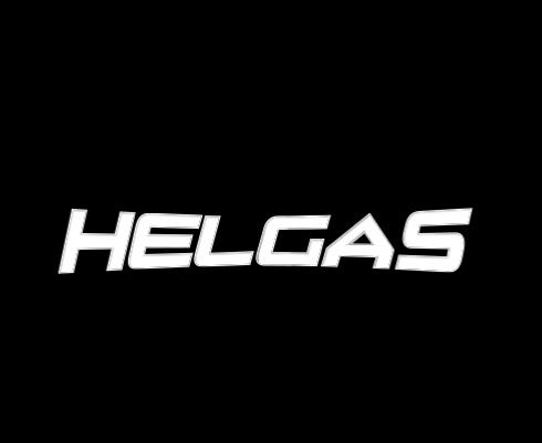
Recognizing the emerging prominence of women's sports globally, I proposed the creation of a bespoke emblem for the newly formed Hastings Valley Helgas. Employing the same design principles underpinning the Vikings' brand, I endeavoured to fashion an identity that remained faithful to the club's essence while retaining its distinctiveness.

By designing the mascot logo featuring a traditional Helga, the letter mark, and the club-branded shield, we created a unique emblem tailored specifically for the women's team. The club's bold and progressive stance in endorsing this initiative for the women's team—uncommon in the sporting landscape of 2015—mirrored the adaptation of the Dutch Lioness, a departure from the men's Lion, signifying that uniqueness and solidarity can harmoniously coexist within a collective identity.